I recently was asked to redesign the highways section of the Cumbria County Council website. When you look at a large section with multiple web pages, it can be difficult to know where to start. However, if you begin with data, mapping and user needs, it nearly always shows you the right path to take.
For my content design work, I use a free tool called Miro. This is a collaborative whiteboard, and it allows me to map everything I need in one space. There are a number of elements I mapped out.
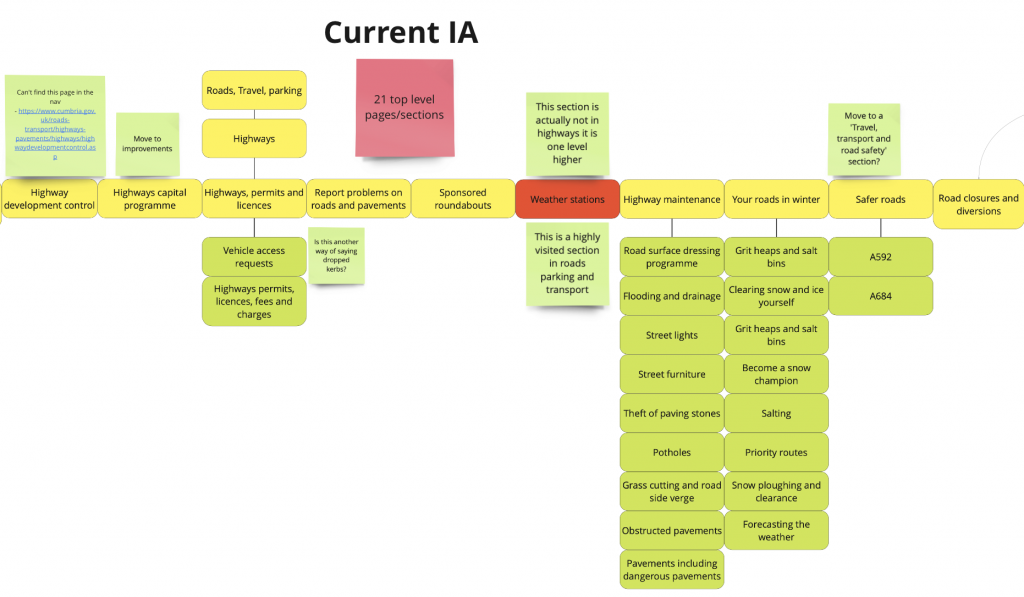
Information architecture (IA)
The IA is how the pages are structured, the hierarchy they sit within. I used Miro to map out the current structure, and then the new structure too.
I used different colours to indicate the different types of content formats, for example directories or guides. This then allows anyone working with me to easily see the structural problems in the IA and proposed improvements.
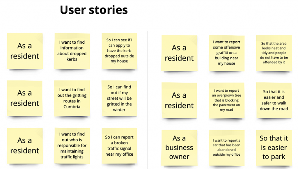
User stories
I next wrote the user stories for highways. An example of a user story is:
- as a resident
- I want to find information about dropped kerbs
- so I can apply to have the kerb dropped outside my home and park my car on my driveway
User stories allow us to ensure the content is focused around the needs of the people who live and work in Cumbria.
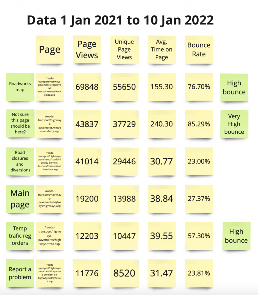
Data
Mapping out what you know about how people currently use the website is a great base to start with. I used Google Analytics data to work out:
- how popular (or unpopular) the pages were
- which pages people clicked on and then immediately clicked away from (bounce rate)
- which pages people spent longer on
Using data in this way allowed me to discover:
- the main things people are interested in
- where people struggled
- where I should focus my attention
Search
Another area I looked at and mapped out was search. Search includes:
- site search – what people type into the search box when they arrive on the site
- search engines – what terms people search for that bring them to the site
By mapping this out it allows me and the people I work with to see what people are interested in and what they might be struggling to find.
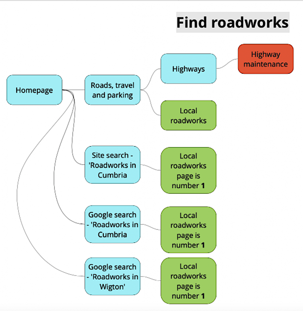
User journeys
Finally I mapped out some typical user journeys. A user journey is the route someone takes to find the piece of information they are looking for. For example they:
- go to a search engine
- type in ‘Road closures’
- land in the ‘Highways’ section
- click on ‘Road maintenance’
- click on ‘Closures’
By analysing common journeys, it becomes easier to see where barriers may lie on someone’s journey to finding what they are looking for. A barrier could include:
- missing pages
- broken inks
- out of date content
- words written in jargon that are not plain English
- pages not being indexed by search
- accessibility issues such as poorly contrasting text
Collaboration
Using a tool such as Miro allows us to work more closely with the service, in this case the highways team. It is easy for people to see all in one place the issues with the web pages, and the proposed solutions.
Collaboration is key when you are designing new content, and this tool allowed me to collaborate in a seamless way.