Cumbria County Council’s website is transitioning to LocalGov Drupal, a new content management system (CMS). Starting with the highways pages, they wanted to carry out user research with residents in Cumbria and hired my company, Telltale Research.
Together we planned a project to compare the usability of the existing Highways section as well as new pages in development.
Our approach
In order to capture a good representation of residents in Cumbria, we went wide with a quantitative survey, which was completed by 228 residents, and deep, with a total of 10 user interviews. They were carried out over Zoom, each lasting an hour.
The survey
In order to distribute the survey, we were fortunate to have available a database of residents who had given consent to take part in research from a previous project. In addition to those, the survey was distributed on Cumbria County Council’s social media channels.
The survey provided a clear picture of the highway’s user profile:
- who they were
- why they were coming to the site
- how satisfied they were with their web experience
This gave us a great snapshot of how the highways section of the website was performing.
We also included an exercise called tree testing’, which helped us to assess the ‘findability’ of pages within the highways section of the website. Tree tests present users with a stripped down structure of the information architecture and it evaluates how easily users are able to find content based solely on the categorisations/page labels.
The results provided a clear indication on where users were experiencing problems and by working collaboratively with the content designer, Ben Hills-Jones, a number of practical changes were made to:
- better signpost content
- create differentiated and recognisable page names
- find ways to accommodate users who take wrong turns when navigating the site
The interviews
The interviews provided rich insight into residents’ experiences of using the current site, and how this compared with the staging site. Through observations of usability and a structured conversation about design, content, and navigation, the necessary improvements emerged.
A number of user story tasks, which were developed by looking at most visited pages on the current site, were developed and participants were asked to complete them during the interview. Examples of scenarios include:
- ‘I am a commuter and I want to know if my route to work has been gritted’
- ‘I am a resident and I want to report a pothole in the pavement’
In the test we were able to observe residents navigate their way through the alpha site. Along with the tree testing, this helped us validate the new structure and understand, not just where they ‘got stuck’, but why they did so.
Lessons learnt across design, content and UX
Design
In our report we argue that good design not only makes for a more pleasurable viewing experience, but that it plays a vital role in reflecting a positive image of the council and the culture it represents.
Users are not necessarily looking for lots of visual content, as the purpose of visiting is more practical in nature, it is rather a question of how the layout, colour palette, contrast, and font improved their experience.
Staying on brand with the colours and logo is important, but having a tertiary colour, for buttons, links or a backdrop, helps to draw the attention to certain elements of importance (in this case ‘report a problem’) and ‘calls to action’.
When considering legibility, it is not just font size that comes into play, but also the contrasting colours between font and background, as well as presenting the information in shorter paragraphs. This plays into the accessibility of the site, which remains one of the priorities for public sector websites.
In terms of the layout, we found that minimising the amount of elements present on the page (text, buttons, links, etc.) helps to reduce visual ‘noise’ and improves wayfinding and efficiency.
We also observed the importance of short descriptions beneath links that lead into a themed section, helping to reduce the amount of indirect clicks, as users read through these before choosing a path.
As the public grows increasingly used to the main GOV.UK website – a website that has already been through rigorous usability testing – leaning up against this for layout, design, and navigation can not only help to enhance usability and trust, has almost become the expected design of a public sector website.
“Most people don’t draw a distinction between local authorities, councils and government. It’s all public sector and public service. A level of consistency might be almost an expectation.”
Female, Allerdale, 55-64
For guidance and tools for digital accessibility we recommend following the guidelines provided by GOV.UK: https://www.gov.uk/guidance/guidance-and-tools-for-digital-accessibility
Content
For the purpose of a local council website, and perhaps specifically for sections similar in nature to highways pages, the content is expected to be straightforward, instructive and clear. A friendly tone is welcomed, but projecting opinions about a particular topic should be refrained from, for example ‘This is a great opportunity’ and the like.
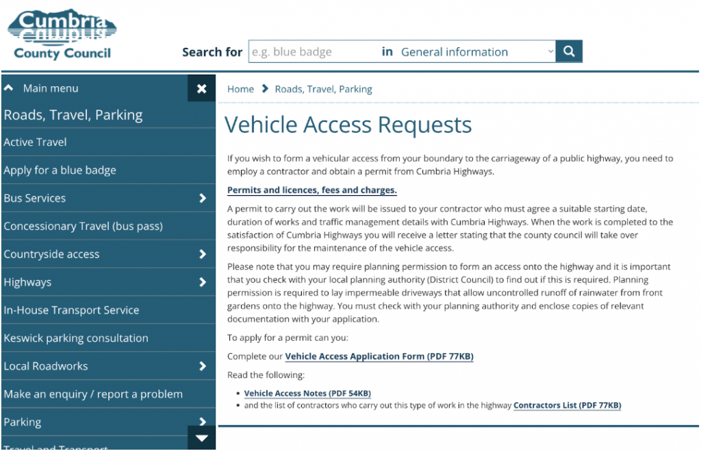
Rather than overcomplicating the copy with technical terms, for example as we found in our testing case ‘to form a vehicular access from your boundary to the carriageway of a public highway’, prioritise comprehension by using language that makes it easy for all to understand what is asked of them at a glance. This will also help with searchability. If necessary, technical terms can always be put in brackets.
As time and language evolves, it may be worth revising certain terms to assess if they are still used in everyday language, such as in this case:
- ‘footways’ instead of ‘pavements’
- ‘roads’ over ‘carriageways’
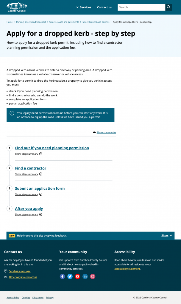
- ‘Apply for dropped kerb’ over ‘vehicle access request’,
“It should say: ‘We’re here to support the people of Cumbria’ and make that welcoming.”
Male, Allerdale, 25-34
Further guidance on content can be found here: https://www.gov.uk/guidance/content-design/writing-for-gov-uk
UX
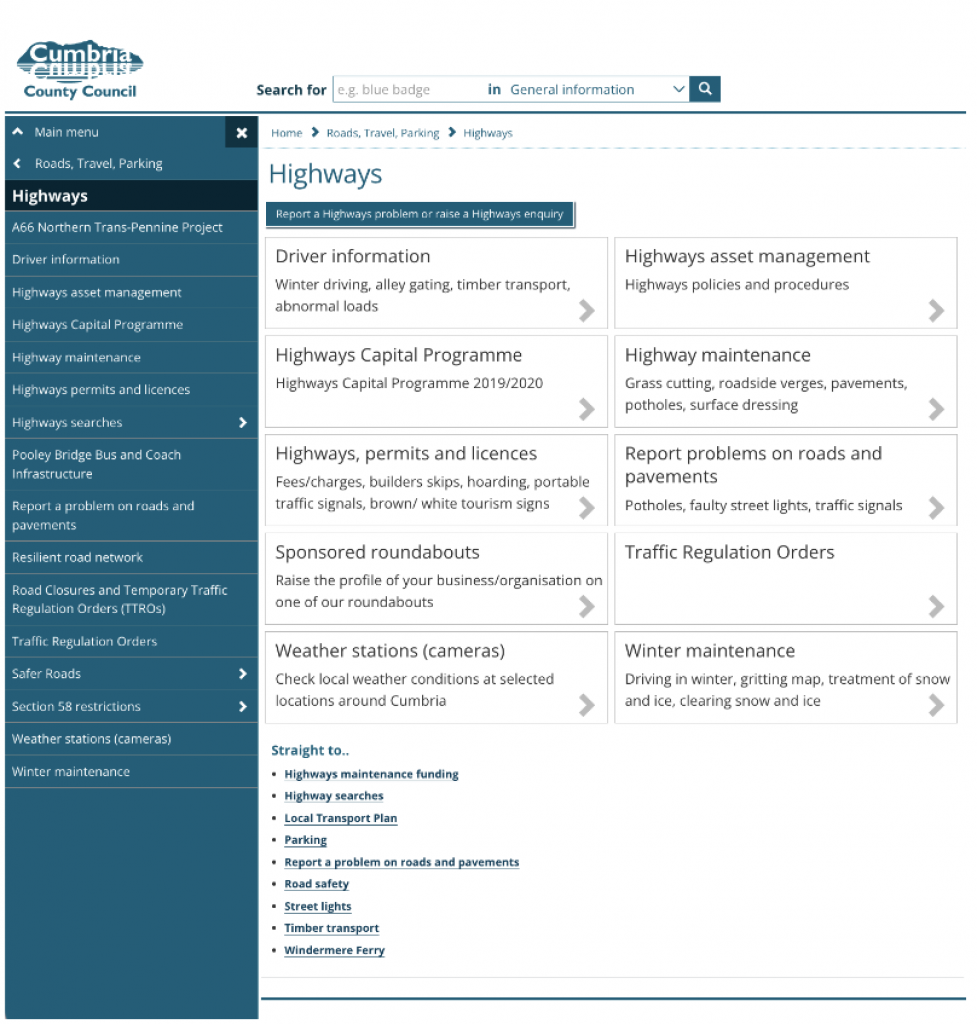
It is important to consider users’ purpose of visiting the particular page and presenting the information according to ‘the why’ users most frequently come to the website for. In this case, to ‘report a pothole’ more frequently than visiting the ‘section 58 restriction’.
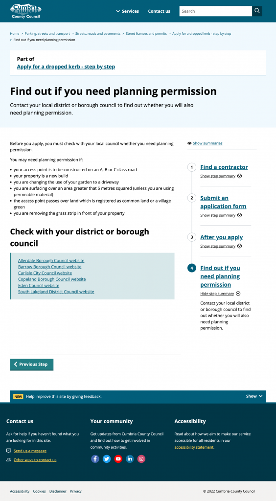
For an application with multiple steps, such as the dropped kerb application, we found the stepper menu helped users break down the process into tangible steps, which made the application seem easier and more accessible.
“This is vastly superior to the other one. It’s simpler, much more straightforward.”
Female, South Lakeland, 55-64
However, when using this design, it is important not to lead users off the site and on to external sites during the journey, where usability may be compromised, if it can be avoided.
To enhance the usability of this process even further, online forms and payments, in addition to printable PDFs, were desired.
Exploration on step by step designing from the GOV.UK website can be found here: https://gds.blog.gov.uk/2018/10/17/building-a-better-gov-uk-step-by-step